2017: Seven months and counting…

By Joshua Chiang

If there is one thing that I always look out for as an illustrator, it is the opportunity to get out of my comfort zone and try new styles. Which is why this year has been pretty awesome thus far.

Well for starters, we finally launched our ‘Candid Cambodia’ series of artprints and greeting cards throughout Phnom Penh, something that had been in the pipeline for the last two years. I don’t really know how best to describe the series other than it is a part-Studio-Ghibli,  part-Where’s Wally (or Waldo for you American folks) way of intepreting Cambodia, rendered in a digital pen and ink style reminiscent of the Tintin comics. (That’s quite a mouthful!)

Some of you might wonder, why only do something related to Cambodia four years after I had relocated there? The short answer is that without the years spent familiarizing myself with the country , its culture and its people, many of the details that makes the subjects quintessentially Cambodian won’t be in the artwork.

So far there are only four artwork in the series, but we aim to add more to it over time. For now it is sold only in selected stores in Phnom Penh and available for order via email (joshua@cerealboxstudios.com) to addresses within Cambodia, but we are taking the series to Siem Reap pretty soon, and you can bet that we’re gonna make it possible to deliver internationally once we sort out the logistics.

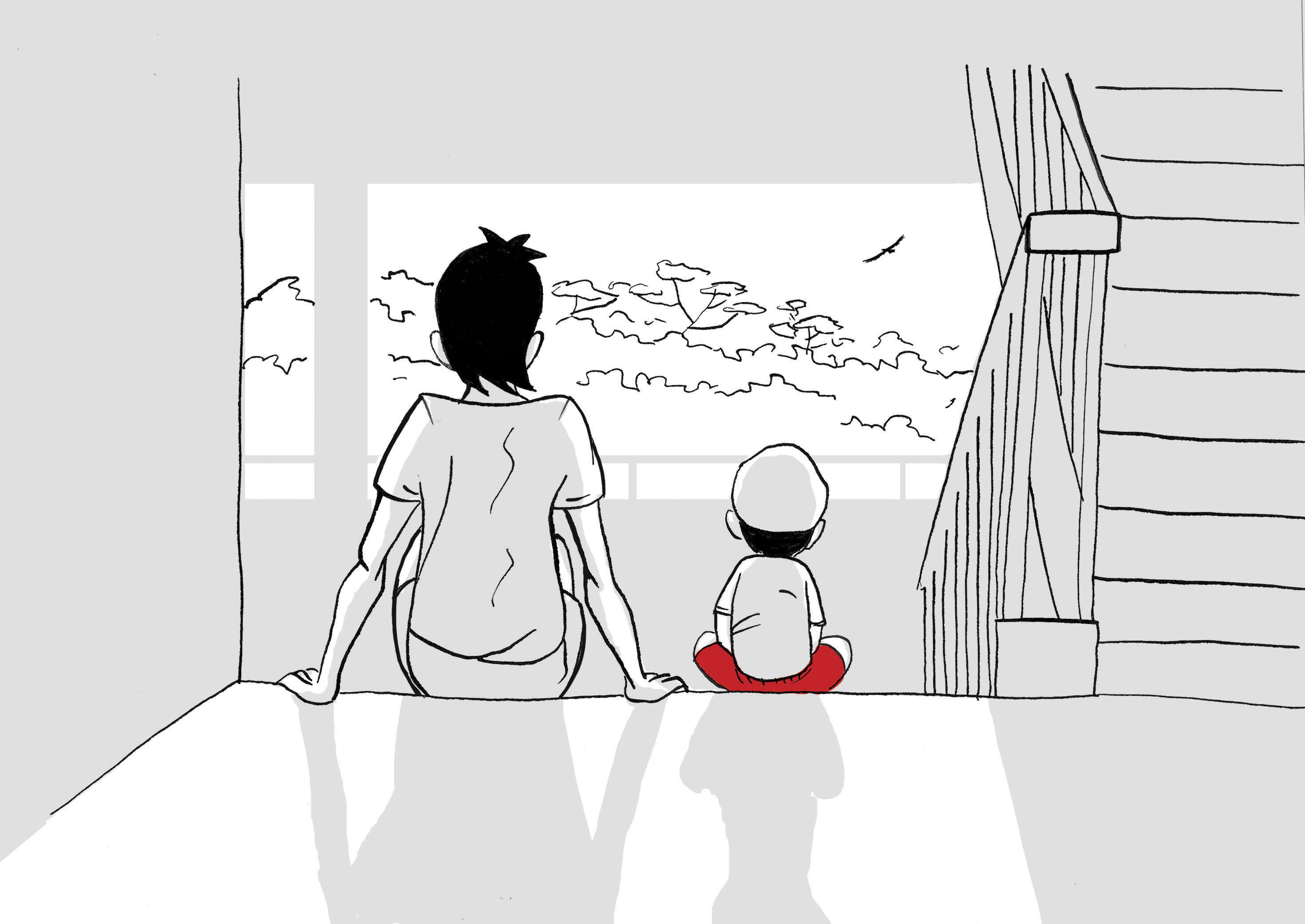
While on the topic of Cambodia, i am also working with author Iain Donelly on an illustrated children’s storybook series based in Cambodia. It’s still early stages, I’m sure Iain has got a couple of stories in the series already completed, but I’ve only just finished conceptualizing the main characters and some backgrounds. Iain gave me almost complete free-rein on this project, so I figured why not imagine the story to be a Little Golden Book adaptation of a Pixar movie? After all, we are keeping the option open for an animated series to happen if this project does well.

Another ‘overseas’ project we were tasked to do was the designing of mascots for Calikids Academy based in Ho Chin Minh City, Vietnam (via Red2). We agreed right from the start that the mascots should also educate children about the endangered endemic species of Vietnam; the client preferred a ‘classic’ look and feel to the design, reminscent of ’80s cartoon series like Smurfs and Gummy Bears. The main mascots are Cali and Kid, two sunbear siblings; being aware that there had been many cartoon bears before, I made it a point to retain the distinctive features that set sunbears apart from other bears such as the pale circles around the eyes and snout and also the pale cresent marking on the chest. Also, sunbears are slimmer. As for the other characters, the animals they represent are the rhino, the asian elephant, the white-cheeked gibbon, and the pangolin. What I also enjoyed was going against type in the designing of the characters. For example, large animal characters tend to be portrayed as somewhat clumsy, but in this case the elephant is a graceful cheerleader. The idea is to inculcate in kids the habit of not stereotyping people. It was a great pleasure to work with the client who share similar beliefs in what else children should be taught besides academic subjects and sports.

Mascots Calikid.jpg

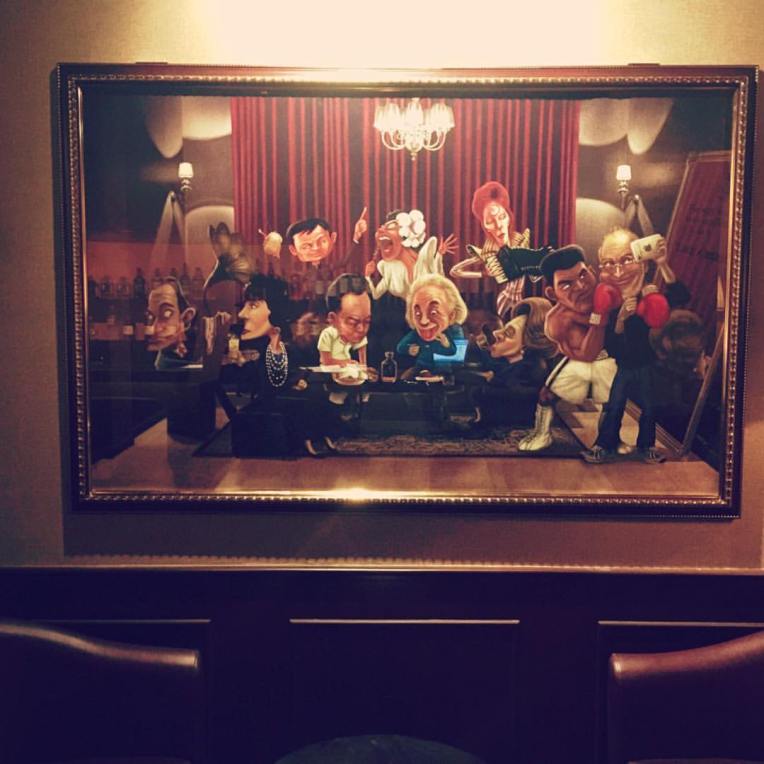
Another project I am happy to claim boasting rights to is to provide a series of wall-mounted artwork for a new gentleman’s lounge in the heart of Phnom Penh – The Bodlein. The owners of the lounge wanted something both classy and modern, we decided that the artworks should reflect the style of the jazz age. But I didn’t want to merely replicate what had been done before; I wanted to drench the art with the airbrushed gloss and shimmer of the soul and disco period.

But the ‘crowning achievement’ is a 90x142cm framed artwork I did for the same lounge, titled “Midnight At the Bodlein”. Featuring caricatures of 10 famous movers and shakers of the world in the last two centuries having a good time in the VIP room of the lounge, it is one of the most complex single piece of artwork I had painted to date. To be fair, I only contributed marginally to choice of the luminaries who are featured in the artwork (but I managed to convince the commissioner of the artwork to include David Bowie as Ziggy Stardust).

Midnight At the Bodleian

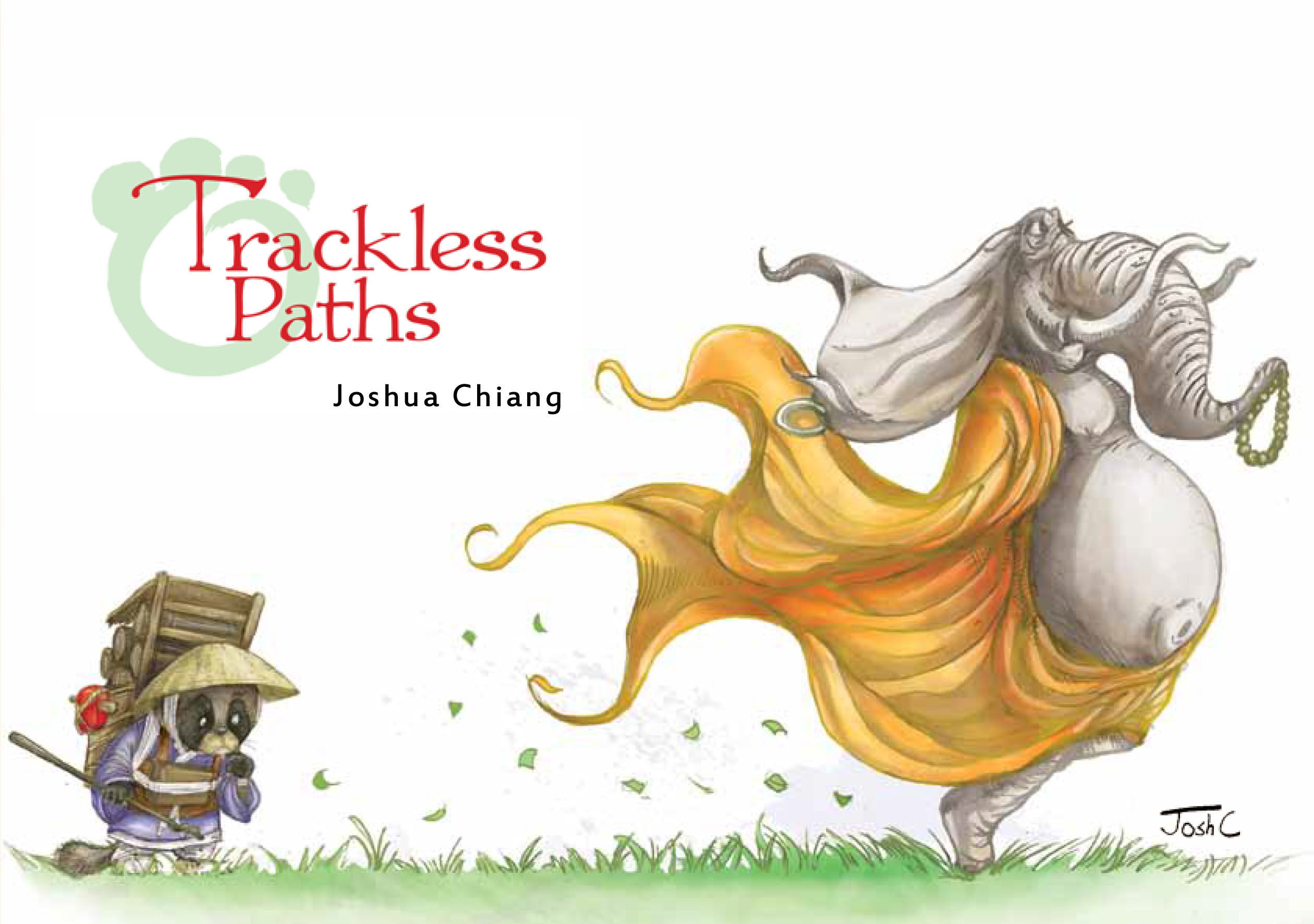
Meanwhile back on the home front, I am finally getting the long-gestating Ronin Rat & Ninja Cat graphic novel off the ground. I’ve put together a 10-page sample of the roughly 180-page, and applied for some funding to ease the financial toll working on this project will take on me. With luck, the book will be on the shelves by 2019!

We’re selling T-shirts (and that’s just for starters…)

In one of the earlier issues of the groundbreaking comic-book series Sandman, an author who has not written another novel since his first and only book became a hit, came into ownership of Calliope, one of the Muses of Greek Mythology. (The Muses were the inspirational goddesses of science, literature and the arts) By holding Calliope captive, the author was able to produce a series of acclaimed and successful novels. Unfortunately, Calliope was the lover of the Sandman, who upon freeing Calliope, punished the author by giving him endless inspirations, thereupon driving him mad.

Last I checked, I did not have any Muse imprisoned in my basement, but if you’re wondering what I do with all the other ideas that were not able to find their way into some stories I am working on, you can check out the photos below, or better still, click on this link!


Pictures of Change – a book review by The Advisor

The following is an extract from a review of Javier’s Day in the weekly Phnom Penh arts and entertainment newspaper The Advisor. The book is now being sold at Monument Books Phnom Penh.

Stairsink

In Javier’s Day, Singaporean illustrator Joshua Chiang captures the changing nature of family life inside Asia’s most outsized economic powerhouse.

At the time of her independence in 1965, Singapore looked a lot like Cambodia does today, with tree-lined quays, stilt homes and man-powered rickshaws dotting the streets. The wealthy lived in yellow two-storey colonials with brick walls, wooden floors and tiled roofs. The poor survived as day labourers. A third of the population lived in slums, unemployment clocked 14% and GDP per capita registered less than $3,000.

Over the last five decades, Singapore has grown into the world’s fourth-largest financial centre and built one of the busiest seaports on the planet. Such dramatic growth has also meant profound changes to the Singaporean family.

“At the heart of it, Javier’s Day is about the joys of growing up all over again through the eyes of the youngest member of the family,” says Chiang, who lives in Phnom Penh, of his first self-published illustrated children’s book. “It is also about how children are raised in the modern Singaporean context. We may have moved out of our kampungs long ago, but it still takes an entire village – plus the maid – to raise one child.”

read the rest of the article here.  

Trackless Paths by Joshua Chiang out now!

This slideshow requires JavaScript.

“Joshua Chiang can’t fool me. This is the product of one who has watched too many cartoons and is still playing with his imaginary friends. His characters have been around long before their lines and colours are pressed onto a page. Their endearing, vivid expressions are those of his soul at its various stages of growth and inquiry. Trackless Paths is a delightful rest house between innocence and experience, listening and applying, on this lonely journey of life we share.”

— Gwee Li Sui
Writer, literary critic, graphic artist

Cerealbox Studios’ Joshua Chiang breathes new life into some of the wisest words ever spoken with an enthralling menagerie of animal characters created especially for this collection Each illustration is rendered in a pencil-and-digital watercolor style, and paired with a saying or an excerpt from writings by sages and literary figures.

Joshua’s animal characters speak with endearing postures, and grab the reader’s heart with the beauty of their fine visual lines matched with the collective wisdom of the ages.

The wise sayings which inspired the illustrations in this book come from a diverse range of spiritual (and the occasional non-spiritual) sources from different cultures and time periods, covering themes from love, to courage, to coping with grief, and are chosen for their ability to inspire, heal and challenge. The diversity is intentional; Wisdom and Truth are not confined to any creed or denomination and there is always beauty in every spiritual tradition. It is this universal beauty that Chiang hopes to share.

The book is sold in Singapore at Select Books and Kinokuniya, as well as online here. 

12 selected pieces of this collection are also available as greeting cards.

Click on this link to find out more.

Trackless path cover_050213

Dreaming up the Trackless Paths

– by Joshua Chiang – 

(‘Trackless Paths’ the book is now out in Select Books and Kinokuniya in Singapore, as well as available online here)

catmakingof78

For the past few years I had been pursuing an improvement to my illustrating craft as well as enriching my life spiritually. Trackless Paths is where these two threads meet. Up to this point, most of my illustrations were rendered in an oil-painting style, and none of the original pencil sketch lines remained in the final painting. I felt that for the subject matter this time round, a softer and more organic look would work better. I had initially wanted to work using digital watercolors in Corel Painter, but it didn’t quite exactly give me the effect I would expect if I were using real watercolor paints (the Real Watercolor brushes in the latest Corel Painter are far superior). I decided to work entirely on Photoshop this time round.

On average, it takes about 5 hours to paint one illustration. (And that is excluding the time it takes to design each character. Designing time varies from ten minutes to an entire day in some cases.) You can see the whole process for one of the illustrations in the photo slideshow below-

This slideshow requires JavaScript.

Reforming the Rat

by Joshua Chiang

I thought I’d wrap up the year by bringing one of my pet projects Ronin Rat and Ninja Cat one step closer to completion. Ronin Rat was a concept I came up with somewhere in 2009; it was originally meant to be a animated feature film, and I already had written the script. But I guess somewhere down the line, I figured it would make more sense for the time being to turn it into a graphic novel first. I had the good fortune to meet someone who would help hook me up with some comic publishers, but it would require more than the script, character designs and concept bible to convince them. It would require a five-ten page sample of what the comic is going to look like.

But as I got started, I realized that the main character of the rat, whose name is ‘Whiskers’ in the script, needed to be redesigned. The original design used in the promotional poster was done prior to the writing of the script, before I had a firm grasp of the character.

Cat and the Fat Rat?

He’s slightly buffoonish-looking, and a bit out-of-shape, someone you won’t expect to be a skilled and intelligent swordsman. It fitted the character I had in mind back then, but as the script evolved, so did the character. Whiskers still remains for much the story the cynical, self-interested, scruffy and penny-less mercenary, but now he is someone you know you should be wary of at first glance. He has to look like a likable rogue who will eventually rise up to the occasion to become the reluctant hero. In other words, a cross between Toshiro Mifune’s Sanjuro, Han Solo and Miyamoto Musashi.

As with most main characters I designed, getting there took quite a while… like more than 50 sketches before I arrived at something that I like.

The Wolverine mutton-chops didn’t hurt.

Fortunately, I pretty much had the other characters nailed down in the previous designs. Which means it’s time to move onto the thumbnails…

Fantastic Mr Fox!

by Joshua Chiang

One of the perks of being a regular illustrator for the promotional materials for Singapore Repertory Theatre’s children plays is to get to offer your own interpretation of beloved children’s fiction character, the latest being the stage adaptation of Roald Dahl’s Fantastic Mr Fox.

Of course the immediate problem it presents is that Wes Anderson’s excellent movie adaptation pretty much sets the standard for how Mr Fox should be imagined. The challenge is to present a different version, and yet one that is true to the spirit of the play and novel (which, as it turns out, do not portray Mr Fox as suffering from a mid-life identity crisis).

The first step is always to do up some rough layout sketches for the client to choose. They wanted to see one version of Mr Fox and the rest of the animals at a dinner table underground as they hide from the wrath of the farmers. I had to take it from an angle that’s different from the version in the poster of the movie adaptation.

But they eventually settled for this other version of Mr Fox standing in front of the tree over his burrow being cheered on by family and friends.

And then it’s time to ‘design’ the characters. The brief is to make Mr Fox look ‘mischievous’. I felt he had to be more than that. He has to be instantly likeable, even if he is a trickster and a thief. At the same time he has to look like he is always come out of any situations smelling of roses. Also, I felt Mr Fox and the rest of the cast had to look like they belong to a typical English countryside in the 1970s, which is the period of time the novel first got published.

Remarkably, I got his look right on the first try; usually it takes more than 4 attempts (sometimes as many as twenty) to get there.

And because it is often very difficult to change colors once you start painting (even if most of the work is done digitally), I often send the client a rough color draft first for their approval. I also wanted to try something new; instead of going for an ‘oil-painted’ look, I felt the whole English-countryside feel (like on the cover of many books written by Thomas Hardy) might be better achieved with a watercolor-look. I went for earthy hues of browns and greens, and avoided strong colors like yellows and blues as much as possible so that the red fur of Mr Fox stands out.

As I wanted to retain a hand-drawn feel as much as possible, it means tracing over an enlarged copy of the original sketch and trying to keep it as ‘clean’ as possible. This final drawing is in A3 size.

And then, onto the painting. I kept mostly to a light-to-dark approach (save for the details of the grass and some highlights), using digital watercolor brushes on low opacity and just building the colors, plus a bit of dodging and burning, and adding some layers of watercolor washes I had done up on watercolor papers over the years. The painting is done entirely in Photoshop. The pencil lines are isolated from the rest of the paper using the ‘Select Color Range’ tool, and then ‘painted’ over with a darker hue of the base color of the object below it.

And lastly, the title. We tried a few versions in different colors, and in the end settled for red, and without the fox tail sticking of the letter ‘O’, which I find somewhat distracting.

If you haven’t already caught the show, you can checkout the showtimes here. It’s on from 1 Nov – 16 Dec 2012. I have been to several of SRT’s shows for children, and even as an adult, I found them immensely enjoyable. Rest assure your kids will have a Digga-digga-digging time watching Fantastic Mr Fox!

Interview with So What? Magazine

by Joshua Chiang

Sometime in September, a new youth magazine started by local publisher Marshall Cavendish called “So What?” featured an interview with me for its 14th issue. You can read it here. Besides the usual questions about what got me into the visual storytelling business, at least half the article was devoted to asking me about my activism when I was with The Online Citizen.

I thought it was really brave of them to do so, considering that The Online Citizen has always been a very vocal critic of the Government and certainly inspiring youths to be pushing the invisible ‘Out of bounds’ markers is something very few mainstream publishers dare to do. It was also extremely humbling to be featured in an issue devoted to civil rights activism, and which included articles about Rev. Martin Luther King and Gandhi. (Although I would say the article about racial riots in Singapore during the ’60s reinforces the often unchallenged status quo that our society is not ready to have a mature and honest conversation about race and religion without denigrating into senseless chaos.)

I did think about what some of my current and potential clients might think about engaging the services of someone who had been a frequent critic of the Establishment, but then again, it only goes to show that creativity and pushing boundaries go hand-in-hand. Quality doesn’t happen when you play safe.

Joshc

(Note: Some of my friends mentioned that I look creepy in the picture the magazine uses of me. Perhaps I really need to start preparing some really well-taken photos of myself just in case I get requests for interviews again)