by Joshua Chiang
One of the perks of being a regular illustrator for the promotional materials for Singapore Repertory Theatre’s children plays is to get to offer your own interpretation of beloved children’s fiction character, the latest being the stage adaptation of Roald Dahl’s Fantastic Mr Fox.
Of course the immediate problem it presents is that Wes Anderson’s excellent movie adaptation pretty much sets the standard for how Mr Fox should be imagined. The challenge is to present a different version, and yet one that is true to the spirit of the play and novel (which, as it turns out, do not portray Mr Fox as suffering from a mid-life identity crisis).
The first step is always to do up some rough layout sketches for the client to choose. They wanted to see one version of Mr Fox and the rest of the animals at a dinner table underground as they hide from the wrath of the farmers. I had to take it from an angle that’s different from the version in the poster of the movie adaptation.

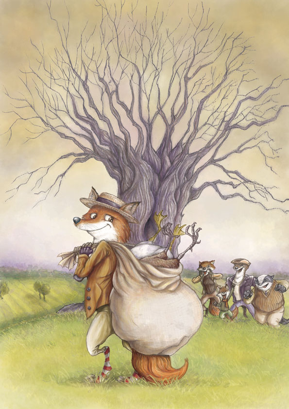
But they eventually settled for this other version of Mr Fox standing in front of the tree over his burrow being cheered on by family and friends.
 And then it’s time to ‘design’ the characters. The brief is to make Mr Fox look ‘mischievous’. I felt he had to be more than that. He has to be instantly likeable, even if he is a trickster and a thief. At the same time he has to look like he is always come out of any situations smelling of roses. Also, I felt Mr Fox and the rest of the cast had to look like they belong to a typical English countryside in the 1970s, which is the period of time the novel first got published.
Remarkably, I got his look right on the first try; usually it takes more than 4 attempts (sometimes as many as twenty) to get there.
And because it is often very difficult to change colors once you start painting (even if most of the work is done digitally), I often send the client a rough color draft first for their approval. I also wanted to try something new; instead of going for an ‘oil-painted’ look, I felt the whole English-countryside feel (like on the cover of many books written by Thomas Hardy) might be better achieved with a watercolor-look. I went for earthy hues of browns and greens, and avoided strong colors like yellows and blues as much as possible so that the red fur of Mr Fox stands out.
As I wanted to retain a hand-drawn feel as much as possible, it means tracing over an enlarged copy of the original sketch and trying to keep it as ‘clean’ as possible. This final drawing is in A3 size.
And then, onto the painting. I kept mostly to a light-to-dark approach (save for the details of the grass and some highlights), using digital watercolor brushes on low opacity and just building the colors, plus a bit of dodging and burning, and adding some layers of watercolor washes I had done up on watercolor papers over the years. The painting is done entirely in Photoshop. The pencil lines are isolated from the rest of the paper using the ‘Select Color Range’ tool, and then ‘painted’ over with a darker hue of the base color of the object below it.
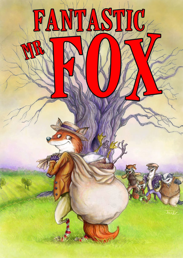
And lastly, the title. We tried a few versions in different colors, and in the end settled for red, and without the fox tail sticking of the letter ‘O’, which I find somewhat distracting.
If you haven’t already caught the show, you can checkout the showtimes here. It’s on from 1 Nov – 16 Dec 2012. I have been to several of SRT’s shows for children, and even as an adult, I found them immensely enjoyable. Rest assure your kids will have a Digga-digga-digging time watching Fantastic Mr Fox!


I enjoyed readinng this