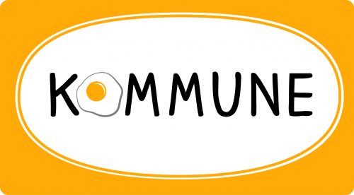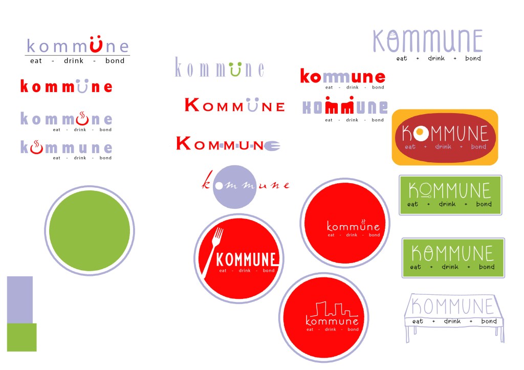
Logo for a casual dining restaurant in Phnom Penh. The client wanted the logo to reflect the cheerful atmosphere of the place. I proposed several ideas (see sketch below) before we settled on one inspired by the restaurant’s specialty – stir-fried food served with a sunny-side-up on a hotplate.

For this logo for a home lifestyle products company, the client wanted a fuss-free logo that also has elements that suggest balance, particularly one based on the concept of Zen. And so the ‘B’ in the abbreviation of the company name is designed to look like one pebble on top of another.

For this logo for a food company that specializes in prawn rolls, the client wanted something that reflects the whimsical nature of the company name (‘Exploding Bear’). The Chinese font for the logo was the most challenging. I tried several commercial fonts before the client settled for something that was hand-drawn.

The logo for my merchandise line Zodak Showdown deserves some mention. As the concept for the merchandise line is based on a fusion of Chinese Zodiac characters and arcade fighting games, I needed a logo to reflect all those elements while retaining a retro feel. Not only did I research logos for existing fighting game franchises; I also plowed through many posters of kungfu movies to get into the frame of mind to create this design.

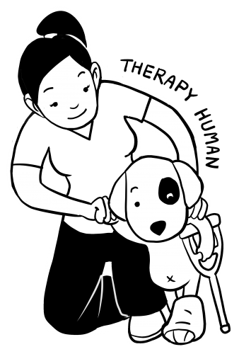
Technically not a logo, but a design for Tshirts for the volunteers at a animal welfare clinic, but I like this design so much it’s a waste not to showcase it!

And finally, a glimpse at the design process. It is not uncommon for me to do many sketches for logos and characters and selecting my best ones to show the client at the early stage of the work. While previously I would sketch in pencil or pen, I find that it doesn’t communicate the ideas as well as concept art that uses available fonts and rendered in vector.
